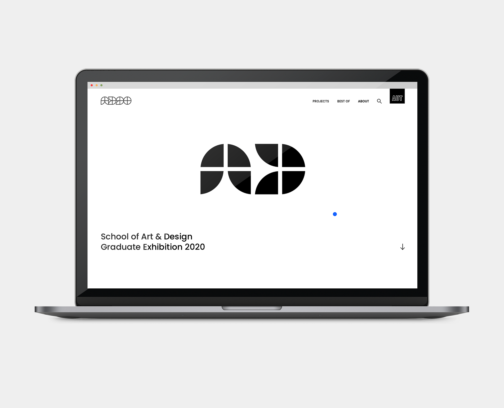
Auckland University of Technology’s annual graduate show was hosted online due to COVID-19 related circumstances. As a result, I worked with a team of three other students under The Draft Studio to fully ideate, develop and design the branding of AD20 (Art & Design 2020) along with the entire website. As a graduating student of the 2020 cohort, this project was extremely important and held a lot of significance in my degree.
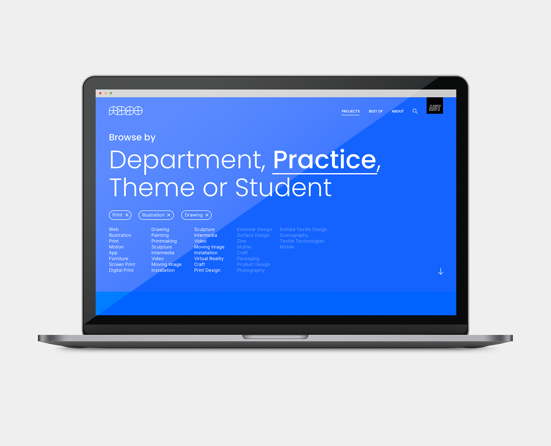
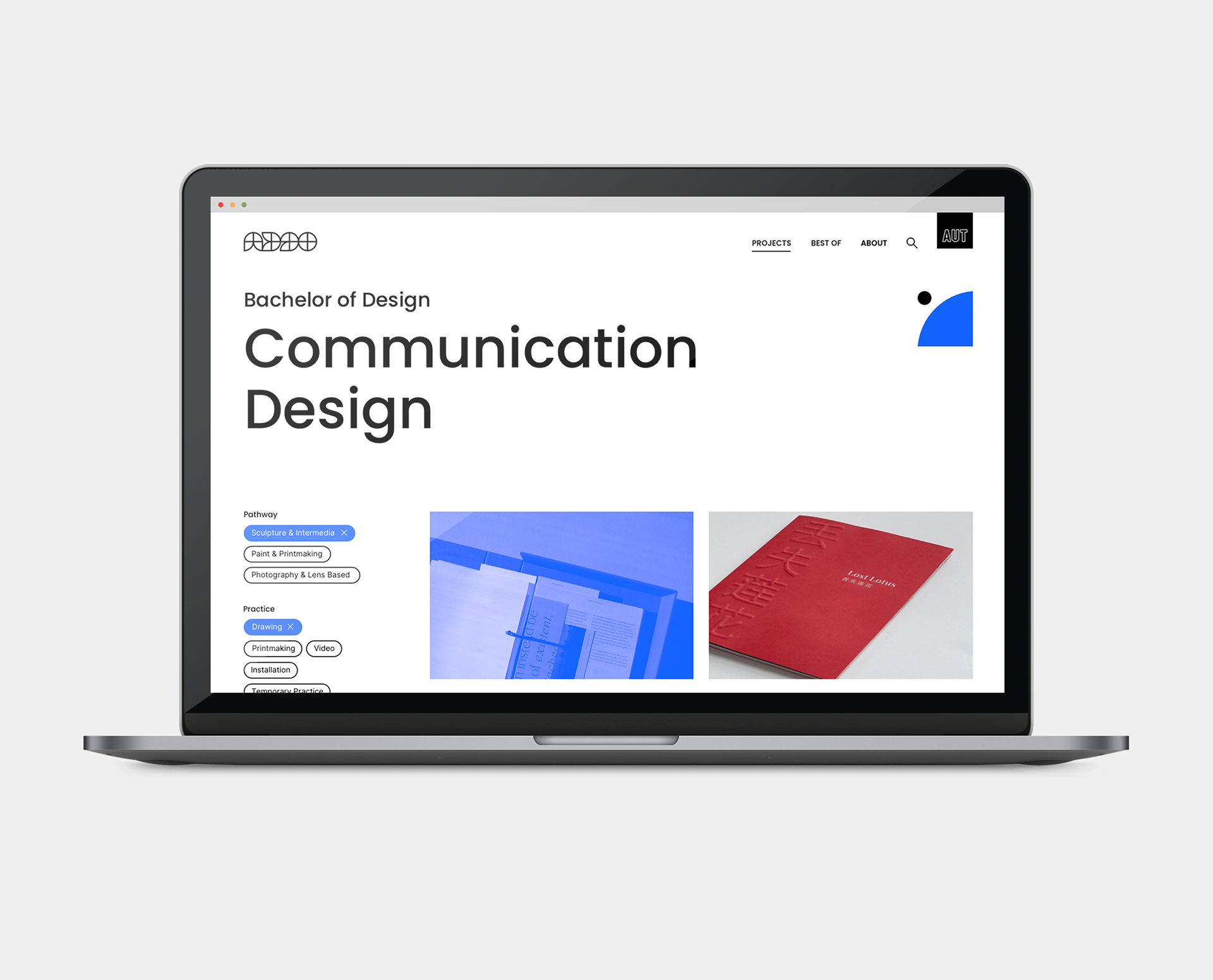
The branding of this exhibition was based on the message of AUT Art and Design disciplines being a range of individual departments coming together to create one cohesive faculty. This was displayed in our modular logo which was constructed through repetition of the same shape in different angles to create type through imagery. The colour choice for this brand was based on the blue featured in the original AUT logo, with a modern and exciting twist to the shade. The type and imagery was all based on the concept of closure, time and the journey of the students coming to a celebratory end.
Brand/UX/Website/Type/Modular/Logo/Exhibition/